Harmony within Volcom
Repetition through waves
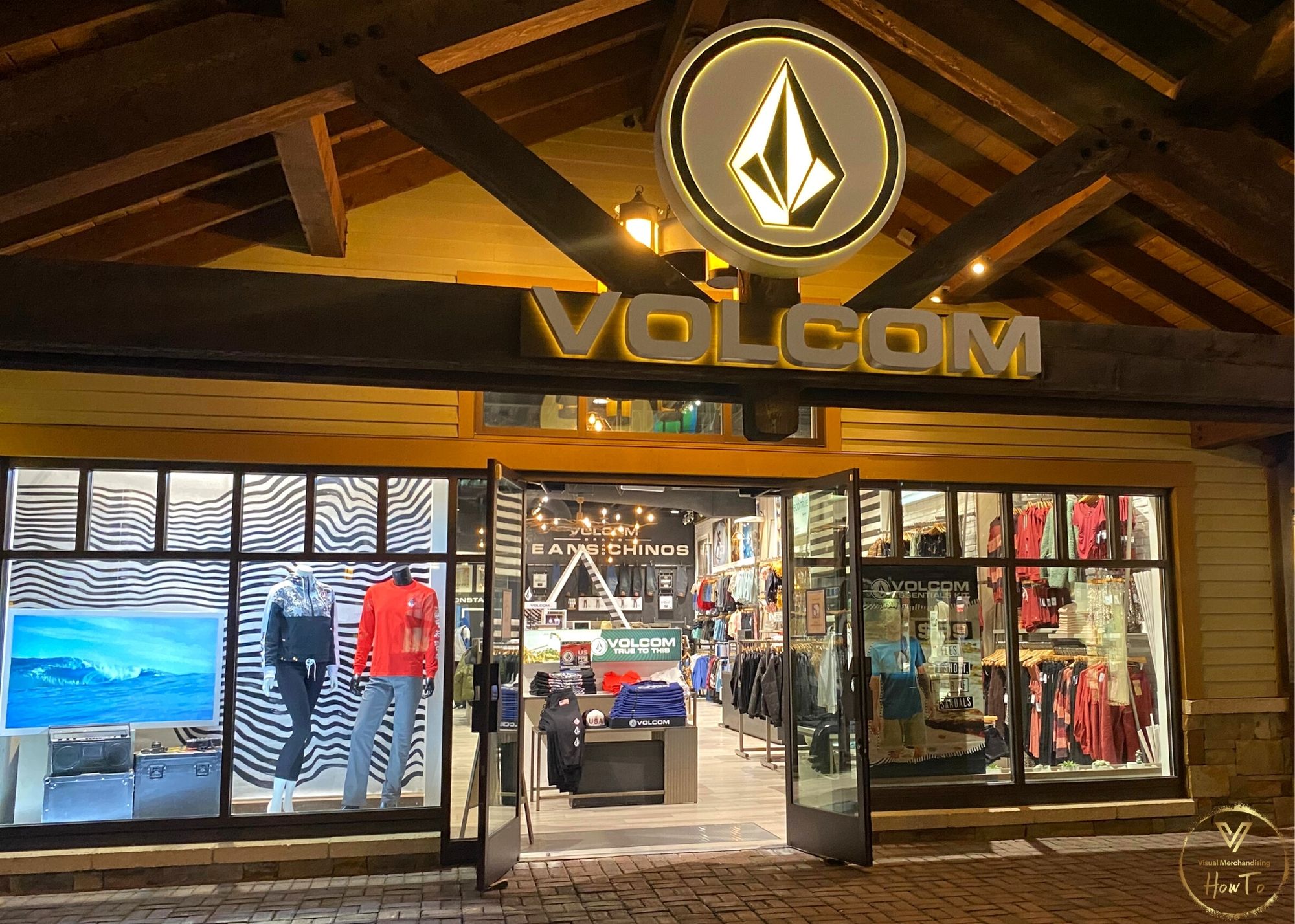
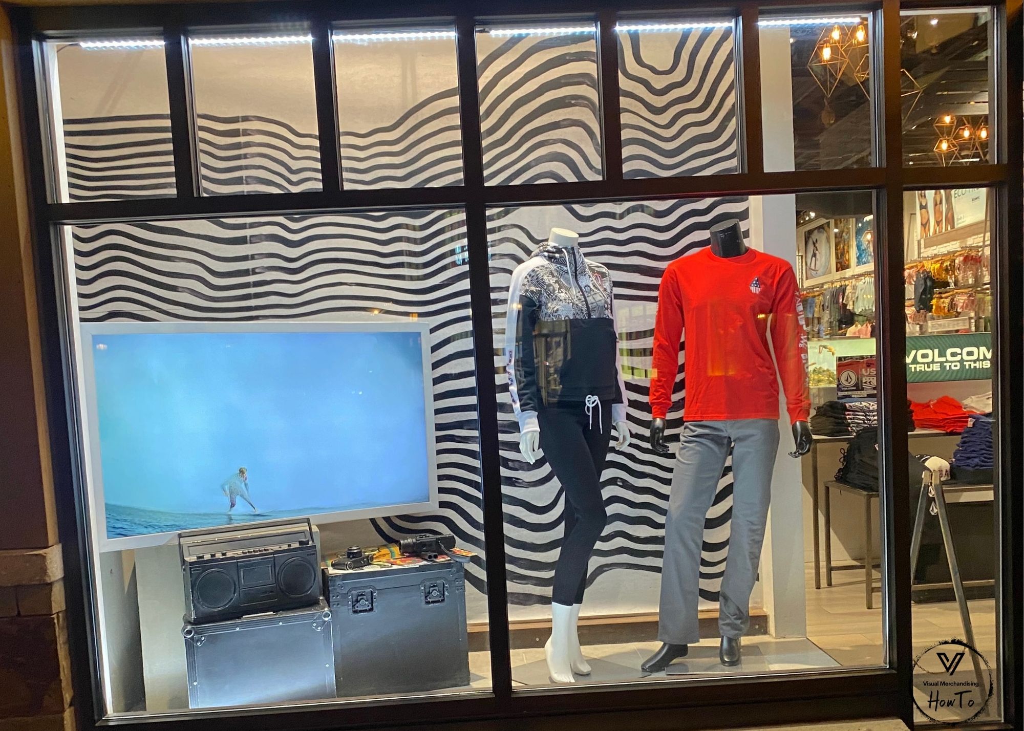
Short Description: Volcom semi closed back window display example
Location of Photo: Disney Springs, Disney World Orlando, Florida
Company: Volcom
The following elements are the expressed opinions of the VMHT editor(s). They are not right, they are not wrong, they are opinions! We would love to hear yours in the comments below! Thank You.
Element #1: Monochromatic color scheme with the use of black and white with a pop of red on the mannequin.
Element #2: Texture is smooth offset by the reflection of light. The props in the window showcase this texture.
Element #3: Curved line in backdrop shows the flowing movement of the waves and brings a sense of softness.
Element #4: Shape is shown in the display as square and round with the lines of the Volcom. The use of both shapes creates harmony within the window display.
Element #5: Form
Design Principle: Rhythm within the video playing of the surfer and waves moving in front of the black curved lines that show movement emphasis.
Design Principle: Proportion in terms of focus. Focal point of the window display is shown through the movement of the lines on the backdrop towards the two mannequins wearing Volcom clothing.
Conclusion: Volcom’s window display encompasses the brands identity as having dark lines of movement which show how the brand is an action and movement brand geared towards the active lifestyle of skaters, snowboarders, and surfers.


